Add a Flexible Carousel for Users to Browse
Carousel: Content packs a lot of information — up to 5 slides — in a small space. Large arrows at either side and a series of dots below the carousel tell users you have more for them to browse.
Each slide requires an image, but use the Carousel: Image Feature component if you want your photos to be the center of attention.
Carousels are best for content that users might wish to browse if they have time. Don't use them for critical information since many users won't click through them.
You can add a single slide for an unusual effect, or multiple for a full carousel.
Carousel: Content can be added standard or full width but look best full width. If you use them in Components, keep the body text to a minimum.
Carousel: Content Options

Background Color defaults to “Light (white).”
Select “Dark (gray)” to add a slight gray tint behind the entire component.
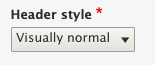
The header style defaults to visually normal, but you can also choose to have it display much smaller. See examples below.
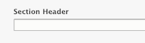
The section header is not required. It will display above the carousel if added.

Click Image to add an image, at least 454 x 454 pixels, using the Add Media dialog box. See Images for detailed instructions.

Enter a heading that describes what is in the slide.

Enter a sub-heading. These are rarely used, but are useful if you'd like more description than the heading gives and still want it to stand out from the body text.

Enter your text. Although the body field is a WYSIWYG editor, options are fairly limited.
Note: All text will be compressed into a single paragraph, even if you break it up into separate paragraphs.

Enter a call to action.
- URL: Enter the web address for the link.
- If the page is on our site, begin typing the title and select the correct page from the dropdown list.
- If the page is not on our site, enter the full URL
- Link Text: Enter a short call to action.
- Keep it short – just a few words.
- Include a verb.
See Links for more information about calls to action.


 and Morgan Garnier ’19 (center) look on as Edouard Duval-Carrié (right) shows them how to remove bubbles in the resin with a blowtorch.")
